0.7.0 Intuitive interface (and many other changes)
Hello everyone!
It's been two months of radio silence, so it's high time for some news... and a new demo release! As I mentioned in the last devlog, I don't want to rush the ending - instead, I've done the exact opposite and raised the bar for how good the game should be! I got past last autumn's "just effing get it released" tedium, essentially thanks to new feedback on how EMUUROM could be a smoother experience. I can't stress it enough - new eyes can provide such a novel perspective for a game designer. I'm endlessly thankful for my new friends at LGIN!
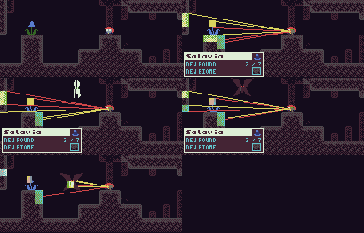
Now I'm back in a much more productive "I want this game to be its best version / but let's also get this done someday" mood. I've quietly been busy working on two major areas: crafting a new, more consistent UI, and making many long overdue bugfixes. The new UI is an answer to an old problem with scanning: scanning new entities stopped the game (so you could read the UI at your own pace), but after scanning consecutive EMUUROM of the same species, the game doesn't stop anymore - yet the UI looks (almost) the same! This was difficult to convey, but I feel like I solved the problem: I made a completely new popup UI for consecutive scans that only displays the relevant information (see above!). Also, to hammer it down that the game is paused on the first scan, the first scan UI goes now full screen (see below).
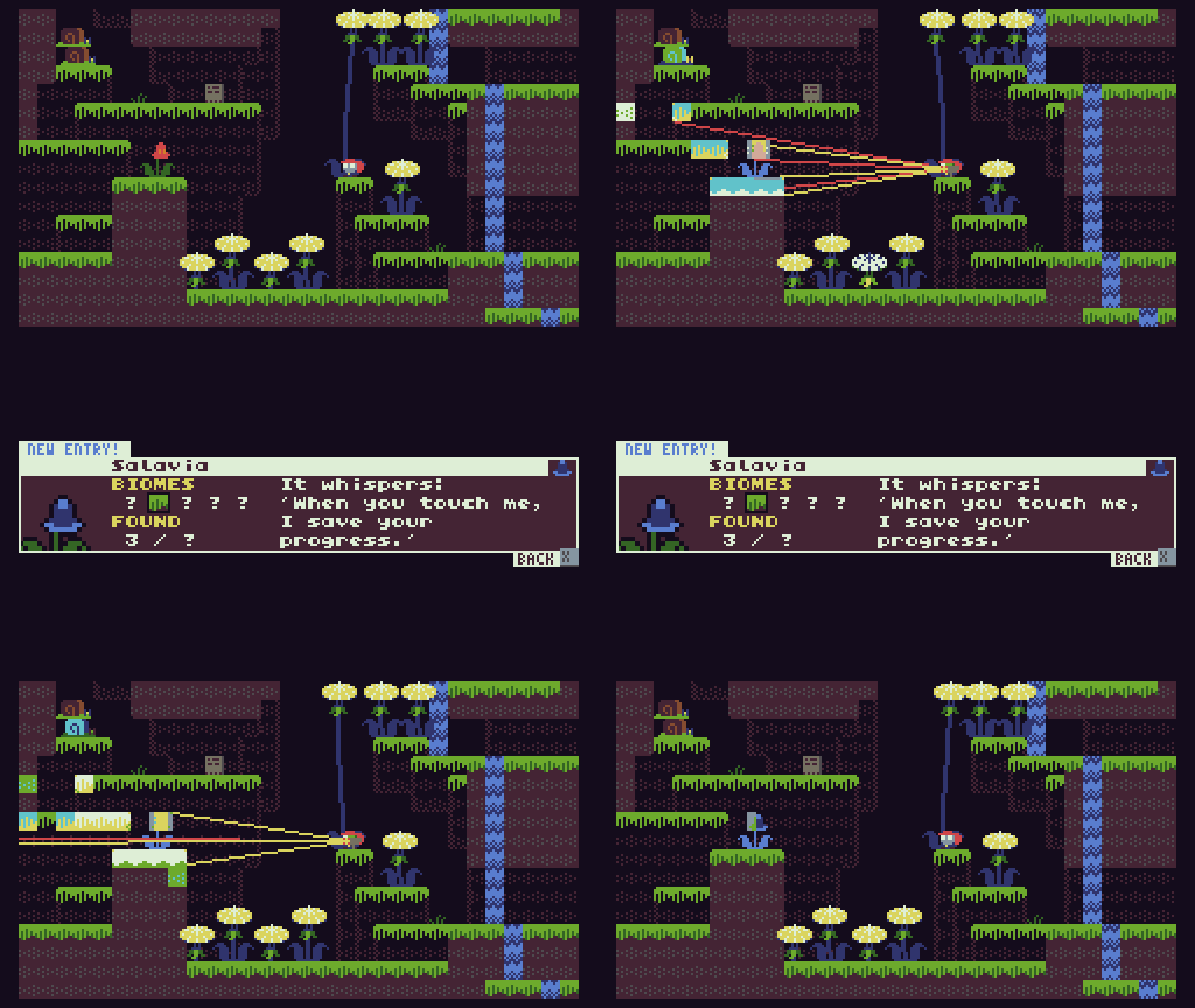
There's even a new transition effect - I really wanted to focus on the visuals here. (I reused the transition effect for opening & closing the EMUUDEX as well.) So yeah... the last two weeks have been very busy for EMUUROM!

Now those two checkboxes are ticked, and I can return to making the oh-so-important-but-still-missing late-game content. I've still been procrastinating on the final rooms... so I'll just keep on procrastinating on them: next up, I'm focusing on the signposts. There are still many missing text entries, especially in the final area. It has been tedious to even get the gist of which signposts work and which don't, so I created a tool to fix that: a new spreadsheet! Yes, 90% of game design problems can be fixed with spreadsheets!
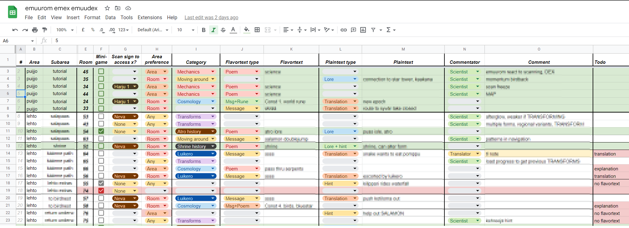
Most importantly, I ordered the signposts in the (somewhat) intended order they are scanned in the game. This already made the information more readable & editable than in the game engine text file, where they are ordered by their room numbers. Even more so helped that I labeled all the signposts. These labels tell what kind of a message do the signposts contain (a poem, runes, hints, lore, etc.), and what is the area preference of the given sign; some signs can be located pretty much anywhere in the game world, but some are very very room-specific, so now I know at a glance which signposts I can safely move around if I need to! Every room needs exactly one sign, after all. No more, no less!
I already went through all the demo area signposts (they're nice and green in the picture above. Green continues to be a nice colour). Next up, I'll be going through, uh, the rest. Not exactly a small task, but the spreadsheet makes it much faster! The signposts have even gotten some new features thanks to this spreadsheet, some of which you might notice in the new demo already...!
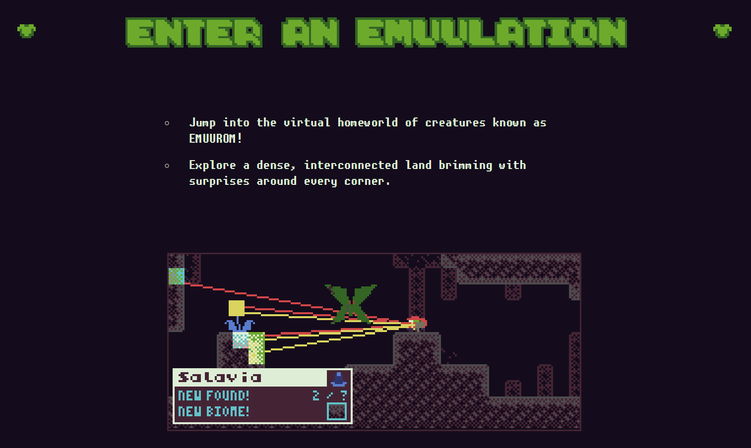
Speaking of the demo: to commemorate the new release, I've updated the Steam page, the EMUUROM website, and the EMUUROM itch.io page! They advertise the game much better now, dontchathink?
Okay, that's all the time I've got. I gotta get back to playing Metroid Prime Remastered on my Nintendo Switch.
Seeya!
PS. Oh, the changelog!
Changelog
UI
- Overhaul map UI, make it fullscreen.
- Map now opens in the room player is in
- Show found & scanned constellations in map
- Fine-tune dex UI as well
- Use same button for exiting dex & map
- Add new unintrusive popup UI for scanning EMUUROM you have previously found
- Also show the popup when scanning the constellation
- Make new EMUUROM scan entry full screen with black background for added clarity
- All UI elements now have a 1pixel wide outline
- Add fadeout: UI elements now disappear smoothly
- Config screen: Simpler graphics, hold any key to continue, both input methods deactivated by default
- Title screen: Add progress bar for deleting your save
- Edit boss intro screen appearance. After the boss is beaten, its text is blue.
Gameplay
- Only DOWN can be used for swimming down, JUMP now swims up
- Kotiloma can be moved when they're scanned
- Kuru Otukka return to sleep in their original location (makes first room easier)
- Don't show sign runes when scanning the sign
- Edit sign entry texts: add runes, add title pages with graphics, add more hints.
- Fine-tune level design in multiple rooms.
- Make 3-5 part of KURU biome
- Choose scanned EMUUROM based on how many scanlines are scanning them
- Edit background tiles to make them appear less solid
- Add short slowmo scene after beating boss, feels better!
- Add tall rune signposts
Fixes
- Fix missing graphics in the intro cutscene
- Fix OOB crash
- Fix constellation being scanned even if rays don't touch the comet
- Speedrun mode toggle is now saved properly
- Fix spoilery OOB stuff
- Other minor fixes
Files
Get EMUUROM
EMUUROM
Nonviolent creature-scanning metroidvania
| Status | In development |
| Author | borbware |
| Genre | Platformer, Puzzle |
| Tags | 8-Bit, Exploration, Metroidvania, Non violent, Pixel Art, Retro, Short, Speedrun, TIC-80 |
| Languages | English |
| Accessibility | Subtitles, Configurable controls, Interactive tutorial |
More posts
- little blog post, as a treat42 days ago
- EMUUROM in Thinky Direct May 29!May 20, 2025
- EMUUROM Status Update 2024Dec 28, 2024
- EMUUROM Status Update... 2023?Feb 29, 2024
- 0.8.2.1 - Time for world domination!Jul 31, 2023
- EMUUROM status update 2022Dec 31, 2022
Leave a comment
Log in with itch.io to leave a comment.